


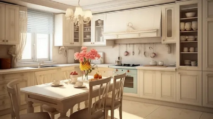
26 Mar Kitchen renovation in light tones: color and material combination ideas
A light-colored kitchen visually expands the space, adds airiness, and makes the interior look neater. This type of renovation on their website is easier to integrate with various styles—from Scandinavian to modern classics—and is easier to update by changing textiles, lighting, and decor.
To prevent light colors from appearing sterile, it’s important to consider color combinations, textures, and contrasts in advance. Balance is achieved through the careful selection of a base tone, warm or cool temperatures, and accents in furniture, backsplashes, and lighting.
Color Combination Ideas: From Subtle to Contrasting
A light kitchen benefits from a thoughtful composition: upper and lower cabinets can differ in tone, the backsplash can support the countertop, and accents can be repeated in two or three spots (for example, in handles, lamps, and textiles).
Light Monochrome: White, Cream, Taupe
Monochrome is suitable for small spaces and open floor plans. To prevent the interior from looking flat, use different textures: matte facades, a semi-matte backsplash, a stone-effect countertop, textured tiles, or wood.
- White + milky – a soft volume without sharp edges.
- Light gray + white – a graphic and modern look.
- Beige + ivory – the warmest and most homely atmosphere.
Light facades + wood: the most “lively” balance.
Wood adds warmth and naturalness, while the light base maintains a sense of spaciousness. It’s important to choose the wood tone that matches the kitchen’s temperature: honey and nutty tones for warm walls, and light oak or ash without a yellowish tint for cool walls.
- White facades + light oak – Scandinavian purity and comfort.
- Light gray facades + walnut – a more prestigious, “deeper” look.
- Cream facades + warm wood – a good base for neoclassical style.
Light kitchen with an accent: pastel or contrast
Accent color helps bring the interior together and make it memorable. To avoid overwhelming the space, one dominant accent and a couple of supporting details are enough.
- Pastel: sage, dusty blue, lavender – suitable for a backsplash, lower cabinets, or a painted wall.
- Graphics: white + black/anthracite – effective in handles, faucets, appliances, and profiles.
- Terracotta: adds warmth and a touch of flavor, especially with beige and off-white shades.
Practical Solutions: Countertop, Backsplash, Floor, and Lighting
In a light-colored kitchen, practicality often depends not on color, but on the texture and quality of the materials. Matte surfaces hide fingerprints, while the pronounced pattern of stone/porcelain tiles makes small marks less noticeable.
- Countertop: Light veined stone or gray-beige “concrete” – versatile and discreet.
- Backsplash: Textured tiles, large-format porcelain tiles, or glass with a neutral undertone; match the grout to create a cleaner appearance.
- Floor: Light oak, gray-beige porcelain tiles, or “stone” of medium saturation – this reduces the visibility of marks.
- Lighting: Combine general lighting, work area lighting, and spotlights above the table; Choose a neutral temperature to prevent white from turning blue or yellow.
If you’re planning to order furniture and want to coordinate shades in advance using samples, it’s convenient to compare palettes and textures on their website and then view the materials in person in daylight and evening light.
Bottom Line: A light-toned kitchen renovation will look expensive and neat if you maintain a consistent color temperature, add contrast in details, and diversify the interior with textures. Then, a light palette won’t look empty, but thoughtful and vibrant.
Choosing a Palette: Warm and Cool Shades and Their Impact on the Perception of Space
A light kitchen can look different even with the same “base” (white, beige, light gray): the color temperature plays a decisive role. A warm palette visually brings surfaces closer and makes the interior cozier, while a cool palette “pushes” walls back and adds a sense of airiness and cleanliness.
To create a harmonious space, it’s important to consider not only color but also lighting: under warm lamps, cool tones are softened, while under neutral or daylight, warm tones become more pronounced. The choice of palette should be tied to the orientation of the kitchen to the cardinal directions, the size of the room, and the desired mood.
How warm and cool shades work in a light kitchen
- Warm light shades (milky, creamy, vanilla, light sand, warm beige, ivory) create a feeling of coziness and “living” light, and complement wood textures well.
- Cool light shades (white with a blue undertone, light gray, pearl, icy beige, light grage in a cool (South side) visually expand the space, making the interior more collected and modern.
- A neutral base (pure white without a clear undertone, soft light gray, balanced grage) is convenient if you want to change accents with textiles and decor without complex alterations.
- Small kitchen: often benefits from a cool or neutral base, with warm accents added selectively (wood, brass, terracotta decor).
- Kitchen with north-facing windows: a warm, light palette compensates for the lack of sunlight and makes the room feel visually “lighter.”
- Kitchen with south-facing windows: cool and neutral shades help avoid “overheating” the interior and maintain a sense of Freshness.
- A unified kitchen-living room space: choose a single base (warm or cool), and create contrast through textures and 1-2 accent colors.
Results: Warm, light shades create a cozier and softer feel, while cool shades create more airiness and visual spaciousness. The most lasting results are achieved when you base your space on the lighting and kitchen size, and adjust the temperature and character of the interior with accents and materials: wood, metal, backsplash, textiles, and lighting.
No Comments